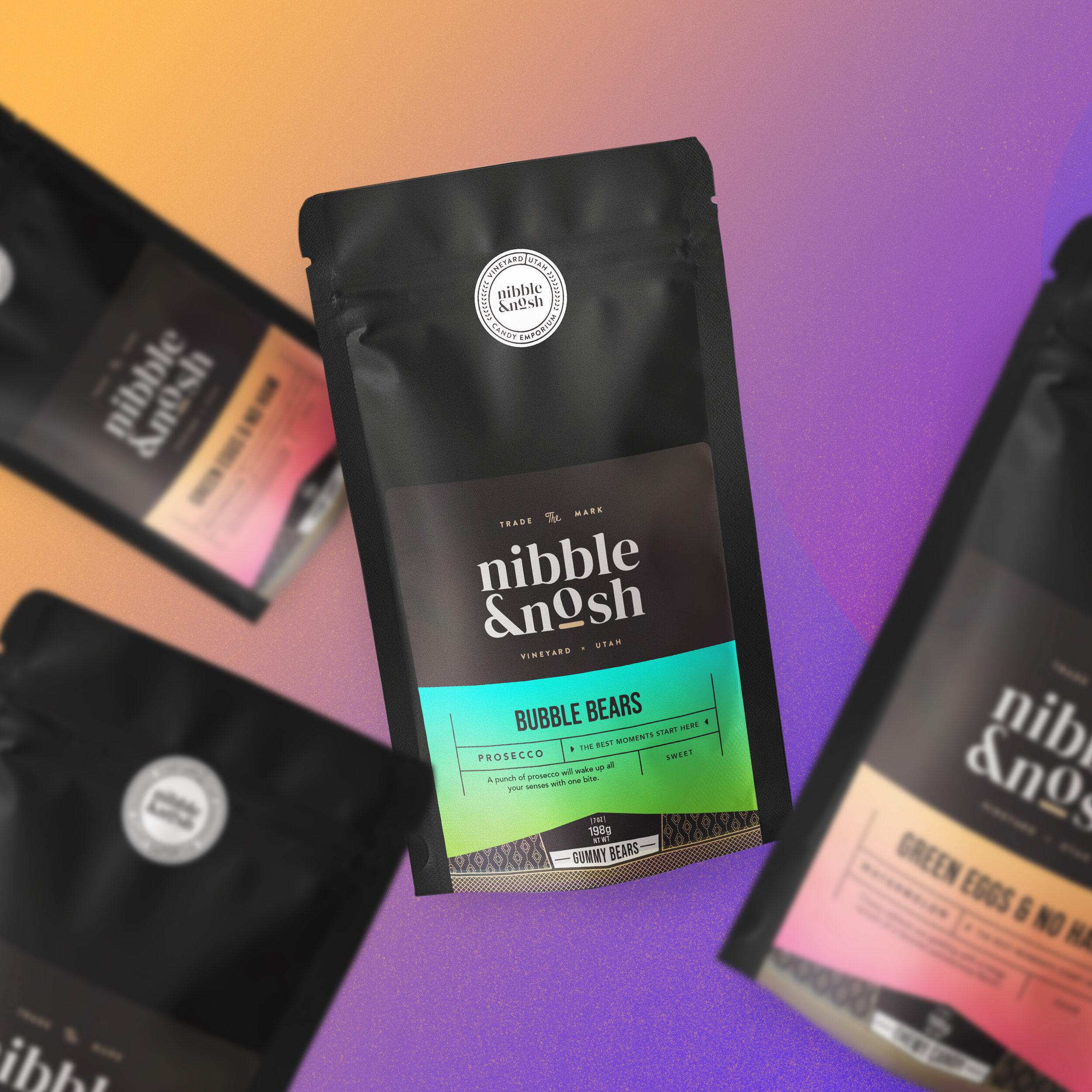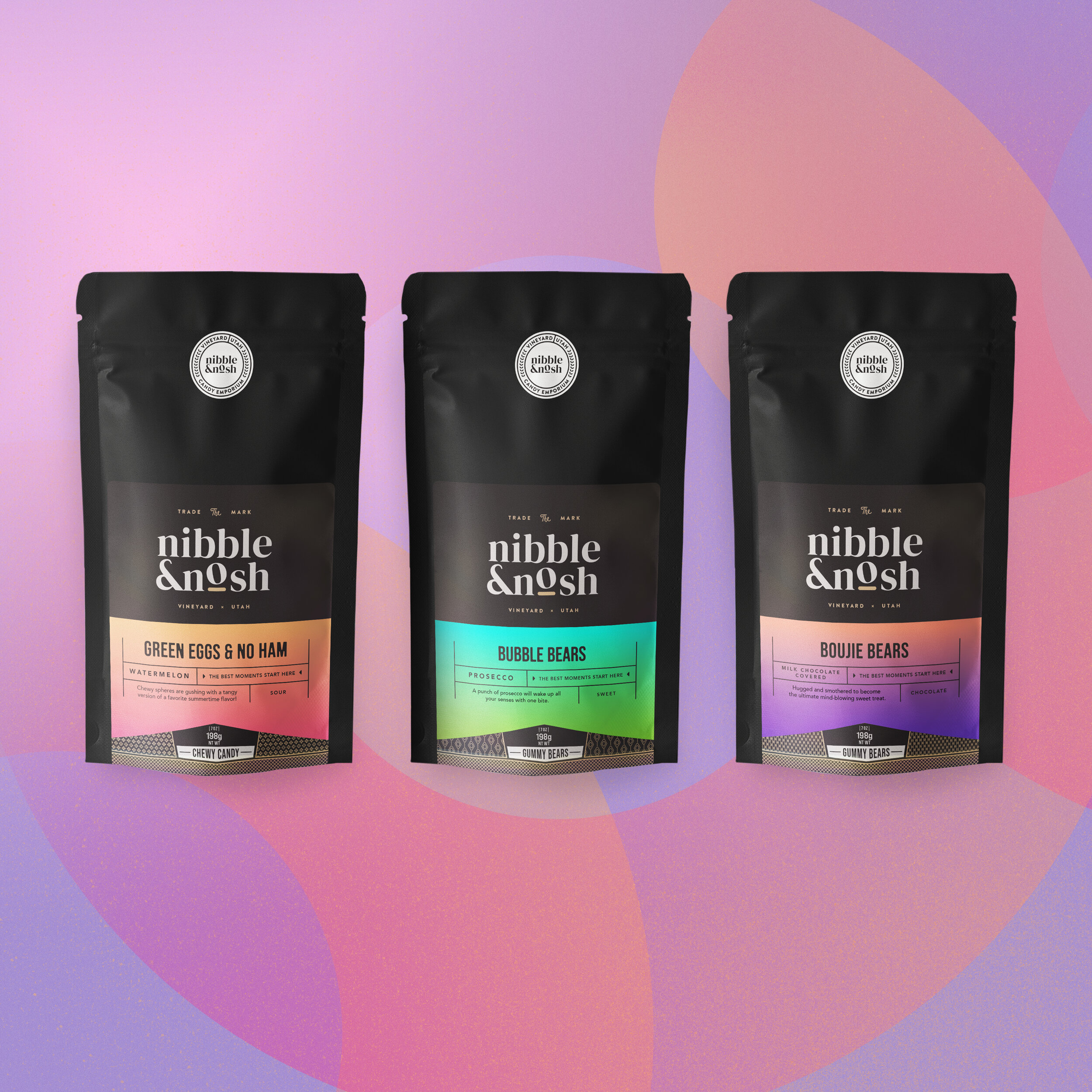
Details
+ ROLE
Lead Designer
+ AGENCY
Freelance
Overview
Nibble & Nosh is an in-house confectionary brand for Mood Distribution. Catering to a large niche market of small businesses, to large boutique owners domestically. They also provide for private labeling confections across the United States.
With hundreds of niche clients, Mood wanted to create it’s own in-house brand. Mood’s goal is to define a new visual look for countless varieties of confectionaries made, or distributed under the Mood brand. Crafting a flexible identity for this new sub-brand and establishing a playful, yet upscale look.


Flexibility
The Mood team approached me in need of a logo and branding system. Looking to not only bring visual connection to their broad scope of products, but also an identity to be flexible enough to work for their exclusive niche market.
The design system is created to be flexible across multiple food categories using gradient color pallets, dynamic patterns, and shapes. Typography plays a heavy roll across all categories as well.
In early discovery, I found Mood caters to a clientele that needs to move, and adapt quickly. Including but not limited to, e.g., market trends, buying habits, and wanting the feeling of new consistently. This meant lead times for printed packaging domestically, or internationally would not always work for their niche market. With their in-house sticker printing, flexibility was priority for faster turnaround. Getting new designs to market within the week or next day was our goal. We moved forward with gradients, and typography for the overall look of the brand. This allowed for easy changes on the fly, and adaptability.
Brand Messaging
Keeping the design and experience simple, I wanted their fun personality to shine through. Taking simple approaches using saturated gradients, and holographic film for stickers supported the playfulness at Mood. Establishing a welcoming feel with a punch of color is a heavy focus. Each aspect of the brand is designed to fuel smiles, and not make you feel guilty about eating delicious snacks, especially in this niche industry.
Consistency
Gradient Color is our constant through each product line, and the N&N brand itself. With consistent rotation of their product lines, I created a brand guideline for the Mood team to adhere to. Creating base designs provided options for Mood to adapt as needed on the fly, without sacrificing the essence of the brand.
The Yield
Transitioning from old labels to new labels has kicked off. Feedback has been positive in select testing markets. Orders have increased 3 to 1 over previous label options. Since Mood Distribution has been word of mouth only, they are excited for new partnerships, and the opportunity to begin marketing with a solid foundation moving forward.


